XKCD-style plots
This notebook has some XKCD-style plots which I’m making for a talk at the Genomic Epidemiology of Malaria (GEM) conference next week. I thought I’d share in case anyone else finds it useful, please feel free to repurpose any of the code below.
import numpy as np
from scipy import interpolate
import matplotlib.pyplot as plt
%matplotlib inline
import seaborn as sns
sns.set_style('white')
plt.xkcd();
rcParams = plt.rcParams
font_size = 14
rcParams['font.size'] = font_size
rcParams['axes.labelsize'] = font_size
rcParams['xtick.labelsize'] = font_size
rcParams['ytick.labelsize'] = font_size
rcParams['legend.fontsize'] = font_sizedef draw_stick_figure(ax, x=.5, y=.5, radius=.03, quote=None, color='k', lw=2, xytext=(0, 20)):
# draw the head
head = plt.Circle((x, y), radius=radius, transform=ax.transAxes,
edgecolor=color, lw=lw, facecolor='none', zorder=10)
ax.add_patch(head)
# draw the body
body = plt.Line2D([x, x], [y-radius, y-(radius * 4)],
color=color, lw=lw, transform=ax.transAxes)
ax.add_line(body)
# draw the arms
arm1 = plt.Line2D([x, x+(radius)], [y-(radius * 1.5), y-(radius*5)],
color=color, lw=lw, transform=ax.transAxes)
ax.add_line(arm1)
arm2 = plt.Line2D([x, x-(radius * .8)], [y-(radius * 1.5), y-(radius*5)],
color=color, lw=lw, transform=ax.transAxes)
ax.add_line(arm2)
# draw the legs
leg1 = plt.Line2D([x, x+(radius)], [y-(radius * 4), y-(radius*8)],
color=color, lw=lw, transform=ax.transAxes)
ax.add_line(leg1)
leg2 = plt.Line2D([x, x-(radius*.5)], [y-(radius * 4), y-(radius*8)],
color=color, lw=lw, transform=ax.transAxes)
ax.add_line(leg2)
# say something
if quote:
ax.annotate(quote, xy=(x+radius, y+radius), xytext=xytext,
xycoords='axes fraction', textcoords='offset points',
arrowprops=dict(arrowstyle='-', lw=1))
fig, ax = plt.subplots()
draw_stick_figure(ax, quote='Hello World!')
draw_stick_figure(ax, x=.8, y=.8, radius=.01, quote="I'm small!", lw=1)
draw_stick_figure(ax, x=.2, y=.7, radius=.05, quote="I'm big!", lw=2)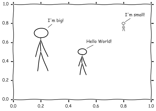
# two columns: date (year), optimism
data = np.array([
    [2013, 0],
    [2013 + 3/12, 0],
    [2013 + 6/12, .2],
    [2013 + 9/12, .3],
    [2014, .5],
    [2014 + 3/12, .5],
    [2014 + 8/12, .6],
    [2014 + 10/12, -.9],
    [2015, -.6],
    [2015 + 3/12, -.3],
    [2015 + 6/12, .1],
    [2015 + 9/12, -1.3],
    [2016, -.6],
    [2016 + 3/12, -.3],
    [2016 + 6/12, .1],
    [2016 + 7/12, .2],
    [2017, .2],
    [2018, .2],
])
x = data[:, 0]
y = data[:, 1]

# smooth the data
tck = interpolate.splrep(x, y, s=0)
xnew = np.linspace(min(x), max(x), 300)
ynew = interpolate.splev(xnew, tck, der=0)
def plot_optimism(ax, upto=None):
# setup axes
sns.despine(ax=ax, offset=15)
ax.set_ylim(-1.5, 1.5)
ax.set_yticks([-1, 0, 1])
ax.set_yticklabels(['despair', '0', 'hope'])
ax.set_xlim(2013 + 6/12, 2016 + 9/12)
ax.set_xticks([2014, 2015, 2016])
ax.set_xticklabels([2014, 2015, 2016])
ax.set_ylabel('Optimism')
ax.spines['bottom'].set_position('center')
ax.set_title('An unofficial history of the Ag1000G project', fontsize=16)
# plot GEM conference dates
ax.axvline(2014 + 6/12, -1, 2, linestyle='--', color='k')
ax.axvline(2016 + 6/12, -1, 2, linestyle='--', color='k')
ax.annotate('GEM2014', xy=(2014+6/12, -1.5), xytext=(2014+6/12, -1.6),
xycoords='data', textcoords='data', ha='center', va='top')
ax.annotate('GEM2016', xy=(2016+6/12, -1.5), xytext=(2016+6/12, -1.6),
xycoords='data', textcoords='data', ha='center', va='top')
# plot optimism
if upto:
flt = xnew < upto
x = xnew[flt]
y = ynew[flt]
else:
x = xnew
y = ynew
ax.plot(x, y, zorder=20)
fig, ax = plt.subplots(figsize=(10, 6))
plot_optimism(ax, upto=2014+6.5/12)
ax.annotate('Phase 1 raw SNP data', xy=(2014+2/12, .5), xytext=(10, 40),
            xycoords='data', textcoords='offset points', ha='right', va='bottom',
            arrowprops=dict(arrowstyle='->', lw=2))
ax.set_yticks([0, 1])
ax.set_yticklabels(['0', 'hope'])
fig.tight_layout();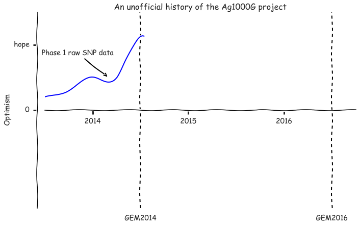
fig, ax = plt.subplots(figsize=(10, 6))
plot_optimism(ax, upto=2014+10/12)
ax.annotate('Phase 1 raw SNP data', xy=(2014+2/12, .5), xytext=(20, 40),
            xycoords='data', textcoords='offset points', ha='right', va='bottom',
            arrowprops=dict(arrowstyle='->', lw=2))
draw_stick_figure(ax, x=.4, y=.77, quote='Too ... much ... data ... ', radius=.02, xytext=(-20, 30))
fig.tight_layout();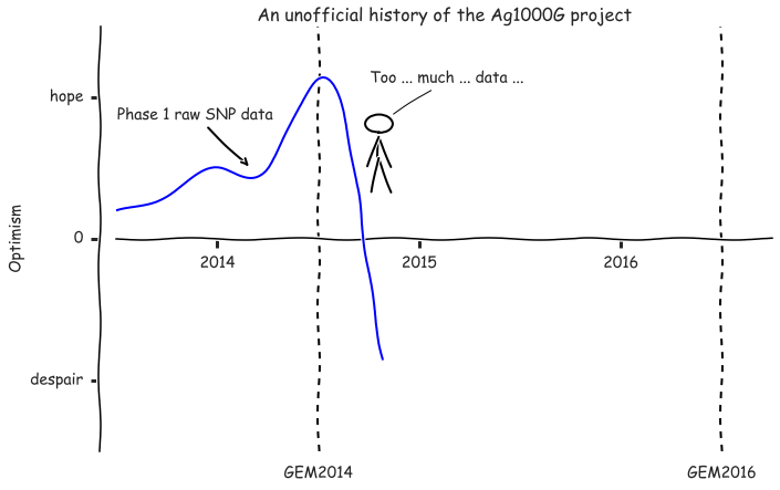
fig, ax = plt.subplots(figsize=(10, 6))
plot_optimism(ax, upto=2015+5.8/12)
ax.annotate('Phase 1 raw SNP data', xy=(2014+2/12, .5), xytext=(20, 40),
            xycoords='data', textcoords='offset points', ha='right', va='bottom',
            arrowprops=dict(arrowstyle='->', lw=2))
ax.annotate('genome accessibility', xy=(2014+11/12, -1), xytext=(10, -40),
            xycoords='data', textcoords='offset points', ha='left', va='top',
            arrowprops=dict(arrowstyle='->', lw=2))
ax.annotate('SNP filtering', xy=(2014+12/12, -.8), xytext=(30, -30),
            xycoords='data', textcoords='offset points', ha='left', va='top',
            arrowprops=dict(arrowstyle='->', lw=2))
ax.annotate('haplotype phasing', xy=(2015+1/12, -.6), xytext=(30, -30),
            xycoords='data', textcoords='offset points', ha='left', va='top',
            arrowprops=dict(arrowstyle='->', lw=2))
ax.annotate('SNP validation', xy=(2015+2/12, -.4), xytext=(30, -30),
            xycoords='data', textcoords='offset points', ha='left', va='top',
            arrowprops=dict(arrowstyle='->', lw=2))
ax.annotate('haplotype validation', xy=(2015+4/12, -.2), xytext=(30, -30),
            xycoords='data', textcoords='offset points', ha='left', va='top',
            arrowprops=dict(arrowstyle='->', lw=2))
ax.annotate('Phase 1 AR3 public data release', xy=(2015+6/12, .2), xytext=(-20, 50),
            xycoords='data', textcoords='offset points', ha='center', va='bottom',
            arrowprops=dict(arrowstyle='->', lw=2))
fig.tight_layout();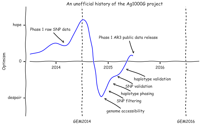
fig, ax = plt.subplots(figsize=(10, 6))
plot_optimism(ax, upto=2015+9.5/12)
ax.annotate('Phase 1 raw SNP data', xy=(2014+2/12, .5), xytext=(20, 40),
            xycoords='data', textcoords='offset points', ha='right', va='bottom',
            arrowprops=dict(arrowstyle='->', lw=2))
ax.annotate('Phase 1 AR3 public data release', xy=(2015+6/12, .2), xytext=(-20, 50),
            xycoords='data', textcoords='offset points', ha='center', va='bottom',
            arrowprops=dict(arrowstyle='->', lw=2))
draw_stick_figure(ax, x=.6, y=.35, quote='Population genetics???', radius=.02, xytext=(25, -30))

fig.tight_layout();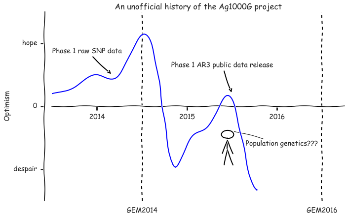
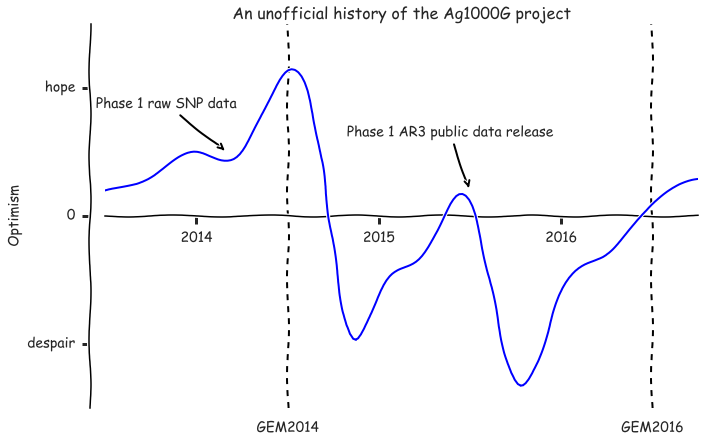
fig, ax = plt.subplots(figsize=(10, 6))
plot_optimism(ax)
ax.annotate('Phase 1 raw SNP data', xy=(2014+2/12, .5), xytext=(10, 40),
            xycoords='data', textcoords='offset points', ha='right', va='bottom',
            arrowprops=dict(arrowstyle='->', lw=2))
ax.annotate('Phase 1 AR3 public data release', xy=(2015+6/12, .2), xytext=(-20, 50),
            xycoords='data', textcoords='offset points', ha='center', va='bottom',
            arrowprops=dict(arrowstyle='->', lw=2))
fig.tight_layout();